Look closely at the dark mode on the SaaS products that feel most premium right now and you'll notice something: none of them are actually black. The pure #000 background that defined the first wave of dark mode is quietly being replaced by warm dark - near-black backgrounds with a hint of temperature, grays that lean slightly warm, and accents chosen to glow against them rather than vibrate. It's a small shift with a big effect on how expensive a product feels. Here's what changed and how to build it.
Why pure black is a mistake
Pure #000 seems like the obvious choice for dark mode, and it's usually the wrong one. On OLED screens, black next to bright white text creates harsh contrast that causes halation - text appears to smear or glow for tired eyes. Pure black also flattens depth: with nothing darker to recede to, shadows and elevation stop working, so every surface looks like it's on the same plane. And it reads as cheap, because it's the default a framework gives you before anyone has made a design decision.
What 'warm dark' actually means
Warm dark starts the background a few points above black and nudges the hue toward warmth instead of the default cool blue-gray. The surfaces layer up from there, so elevation reads. Text is off-white rather than pure white, which softens the contrast without losing legibility. The whole palette shares a subtle temperature, which is what makes it feel considered rather than generated.
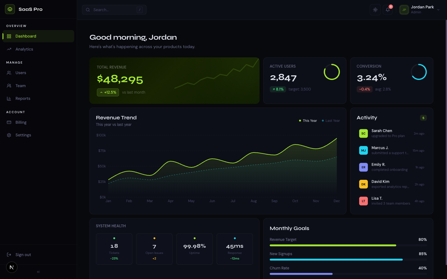
Related template
SaaS Dashboard ProA premium analytics dashboard with a bold midnight + electric lime design system, bento grid layout, interactive charts, and full dark mode.
/* Cool default dark (the framework default) */
--bg:      #000000;
--surface: #0a0a0a;
--text:    #ffffff;

/* Warm dark - near-black with temperature, off-white text */
@theme {
  --color-bg:      #0b0b0c;  /* not black - a hair of warmth */
  --color-surface: #151412;  /* layers up so elevation reads */
  --color-border:  #262320;  /* warm hairline, not cool gray */
  --color-ink:     #f7f3ea;  /* off-white, softer than #fff */
  --color-muted:   #a8a29a;  /* warm-leaning muted text */
}
Accents that glow instead of vibrate
On a warm near-black, saturated cool accents (electric blue, pure violet) tend to vibrate and feel harsh. Warm accents - amber, gold, coral, terracotta - sit naturally against the background and read as a glow rather than a clash. This is why so many premium 2026 dark themes have converged on warm accent colors: they're working with the background temperature, not against it. If you want a cool accent, desaturate it slightly and it'll settle down.
Get the free template, plus new drops
DocsKit Free lands in your inbox right away. New templates after that.
The other trends riding alongside it
- Subtle film grain or noise texture over flat backgrounds, to kill banding and add analog warmth
- Editorial typography - a characterful display face paired with a clean UI face, instead of one neutral sans everywhere
- Tinted shadows - shadows that carry a hint of the accent hue rather than flat black
- Flash-free theme switching as table stakes - a blocking inline script so there's no white flash on load
- Restraint with the accent - one confident color used sparingly beats a rainbow of tints
The tell of a considered dark theme in 2026 is that the 'black' isn't black and the grays aren't gray - everything shares a quiet temperature. It's the difference between a theme someone designed and a theme a framework defaulted to.
Keel's 'Gilt' theme is warm dark done deliberately - near-black with a hint of warmth, gold accents that glow, film grain, and flash-free switching. Reskin the whole system from two CSS variables.
See Keel