Most AI startup landing pages fail not because the product is bad but because the page doesn't communicate value fast enough. Visitors decide in the first 8 seconds whether to stay or leave - and most pages spend those 8 seconds on vague headlines and stock gradients instead of showing what the product actually does. Here's every section that needs to work, in order, with the real design reasoning behind each one.
1. The hero - you have 8 seconds
The hero is the only section every visitor sees. Everything else is optional depending on scroll depth. Which means the hero needs to do three things simultaneously: tell visitors what the product is, show it working, and give them a reason to keep reading.
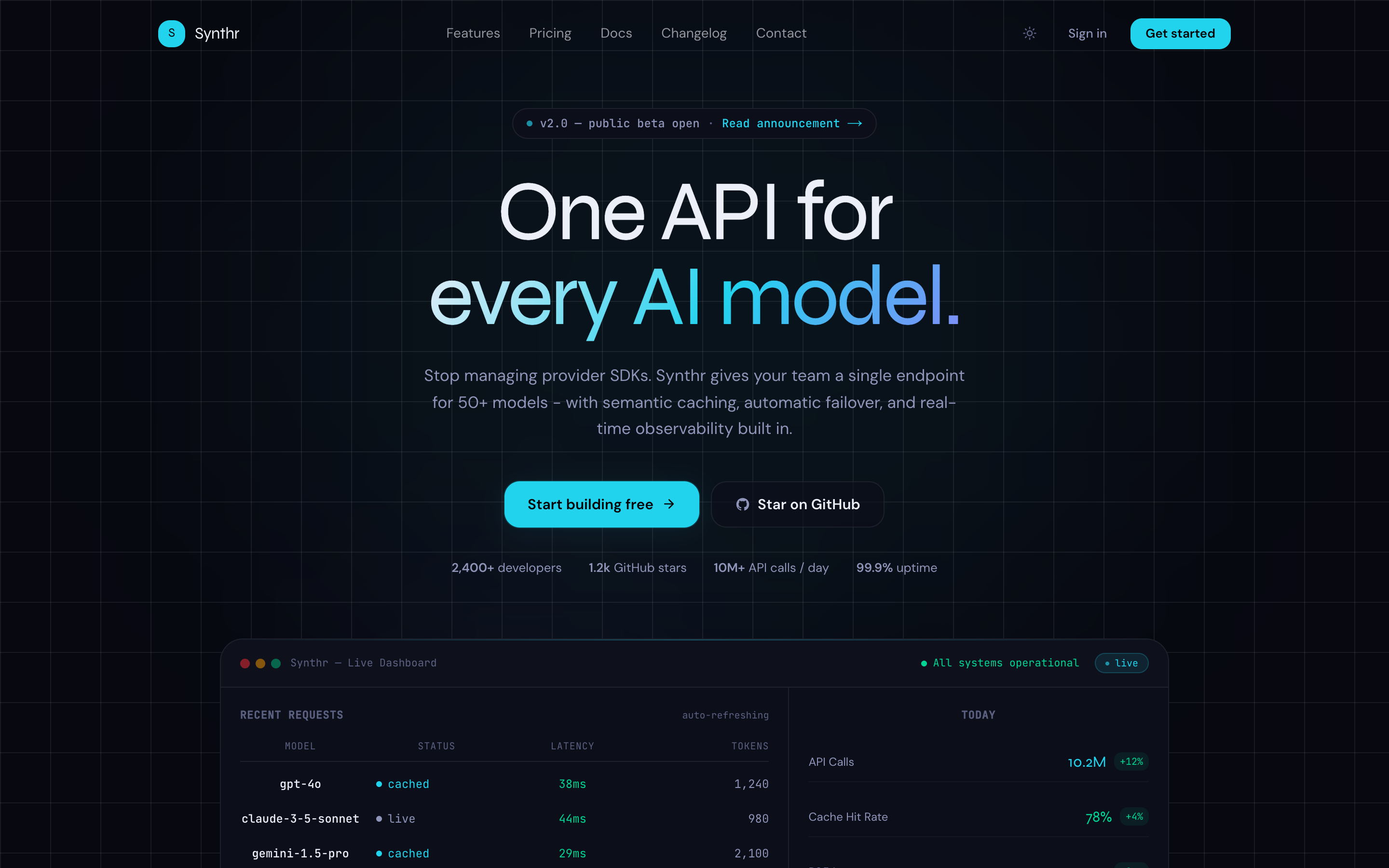
Most AI heroes fail on the second point - they describe the product in words but don't show it in motion. The fix is a hero visual that demonstrates the product rather than decorates around it. For AI tools, an animated API response log, a stream of generated output, or a live data feed does this better than any static screenshot.
- Headline: clear over clever - 'The API that turns documents into structured data' beats 'Intelligence at the speed of thought'
- Subheadline: one sentence on who it's for and what problem it solves
- Primary CTA: action verb + outcome ('Start building free', not just 'Get started')
- Hero visual: show the product working, not a marketing illustration
- Dark-first: AI products read as more technical and authoritative on dark backgrounds
/* Dark-first hero color system - swap 4 variables to rebrand */
@theme {
  --color-background:   oklch(0.07 0.02 280);  /* deep navy */
  --color-card:         oklch(0.11 0.02 280);
  --color-primary:      oklch(0.68 0.18 290);  /* violet */
  --color-primary-glow: oklch(0.68 0.18 290 / 0.15);
}

.hero-glow {
  background: radial-gradient(
    ellipse 60% 40% at 50% 0%,
    var(--color-primary-glow),
    transparent
  );
}
2. The social proof bar
Directly below the hero, before any feature explanation, visitors need a pattern-match signal that says 'real companies use this.' The social proof bar is a single row of logos or a stat strip - nothing more. Its job is to reduce the 'is this legitimate?' question before the reader has invested enough time to care about features.
- Integration logos work even if you don't have customer logos yet - 'Works with OpenAI, Anthropic, Vercel' establishes credibility in the AI space
- Stat bars ('2,400 developers', '98% uptime', '$0 to first API call in 5 minutes') work for early-stage products with no logos
- Keep it to one line - any more and it starts to look like you're compensating
- Grayscale logos look more professional than coloured ones in this context
3. Features - why the bento grid works
The feature section is where most AI landing pages lose people. Long paragraphs about capabilities, or a 3-column grid of identical icon + title + description cards that all blur together. The bento grid solves this by giving different features different visual weight - a larger card for your primary differentiator, smaller cards for supporting features.
The key constraint: each cell needs to communicate its value in under 5 seconds. Title + one line of description + an icon or small visual. If you're writing more than two sentences per feature, you're writing product documentation, not a landing page.
/* Bento grid - primary feature gets double width */
.bento-grid {
  display: grid;
  grid-template-columns: repeat(3, 1fr);
  grid-template-rows: auto;
  gap: 1rem;
}

.bento-featured {
  grid-column: span 2;  /* hero feature takes 2/3 width */
}

/* Mobile: single column */
@media (max-width: 768px) {
  .bento-grid { grid-template-columns: 1fr; }
  .bento-featured { grid-column: span 1; }
}
Related template
AI SaaS LandingA dark-first AI SaaS landing page with bento features, animated hero dashboard, pricing toggle, blog, changelog, docs, and auth pages.
- Lead with your biggest differentiator in the large cell
- 4-6 features total - more than 6 and visitors stop reading
- Use consistent iconography - mixing styles looks unpolished
- Subtle borders or background fills on each cell help scanability
4. How it works - remove the 'but how?' objection
After the feature section, the reader understands what the product does but not how they'd actually use it. The 'how it works' section answers this with a numbered 3-step flow. Three steps is the convention because it feels achievable - more than three and it starts to feel like work.
- Step 1 should be the lowest-friction action possible ('Sign up free', 'Connect your data source', 'Install the SDK')
- Step 2 is the configuration/setup - keep it one sentence
- Step 3 is the outcome - what the user has after completing the flow
- Use action verbs for step labels, not nouns ('Connect' not 'Connection')
- A visual connector between steps (line, arrow, or numbered circles) helps the eye follow the sequence
5. Pricing - the toggle is not optional
The monthly/yearly pricing toggle is standard on AI SaaS pages because it does two things: it makes annual pricing feel like a choice rather than a commitment, and it shows the savings percentage prominently which anchors the annual plan as the 'smart' option. A pricing section without a toggle leaves money on the table.
// Pricing toggle - clean state pattern
const [billing, setBilling] = useState<"monthly" | "annual">("annual");

const price = {
  starter: billing === "monthly" ? 29 : 19,
  pro:     billing === "monthly" ? 79 : 59,
  team:    billing === "monthly" ? 199 : 149,
};

const savings = billing === "annual" ? "Save 35%" : null;- Default to annual selected - most visitors don't change the default
- Show the savings percentage on the toggle, not buried in small print
- Highlight one tier as 'Most popular' or 'Recommended' - it anchors decisions
- Per-tier feature lists should be short - 4-6 bullet points per tier maximum
- Include a free tier or free trial - AI tools without a free entry point have much lower conversion
Get the free template, plus new drops
DocsKit Free lands in your inbox right away. New templates after that.
6. Blog and changelog - the sections most founders skip
A blog and changelog aren't just nice-to-haves for AI SaaS products - they're conversion tools. A changelog that shows active development ('v2.3 shipped last Tuesday') signals that the product is maintained and the team is working. A blog builds SEO that compounds over time. Both are trust signals that late-stage visitors check before signing up.
- Changelog: ship an entry every time you push a meaningful update - even small ones. Frequency signals health.
- Blog: one post per week targeting a keyword your ideal customer searches. 'How to process PDFs with AI' beats 'Our vision for the future of documents'.
- Both pages should be included in your sitemap from day one - they'll start indexing before you have content.
- Link to both from your nav and footer - internal links distribute SEO value.
7. Auth pages - don't phone it in
Login and signup pages are the last impression before a user becomes a customer. Most SaaS products treat them as afterthoughts - plain white form, no brand, jarring transition from the polished marketing site. A signup page that maintains your visual language and reduces form fields to the minimum (email + password, or just SSO) removes a conversion step that most products leave leaking.
- Match the dark aesthetic of your marketing site - a white auth page after a dark landing page breaks the experience
- Minimum fields: email + password is enough. Name can come later in onboarding.
- Social login (Google, GitHub) reduces friction significantly for developer-facing products
- Include a one-line value reminder on the page: 'Start building in 2 minutes. No credit card required.'
What separates pages that convert from pages that just look good
Visual design is table stakes in 2026 - most AI landing pages look polished. What separates the ones that convert is execution on a few unglamorous details:
- Mobile performance: over 60% of landing page traffic is mobile. A page that looks great on desktop and loads in 4 seconds on mobile loses more than half its visitors before they read a word.
- Above-the-fold CTA: the primary signup/trial button must be visible without scrolling on every device size. If it requires a scroll, you're losing signups.
- Page speed: aim for sub-2-second LCP. Every second of delay costs approximately 7% conversion rate. Next.js server rendering gets you most of the way there.
- Headline clarity: 'AI-powered document processing' converts better than 'The future of intelligent document understanding.' Visitors skim, not read.
- Exit intent: the page should have one clear next action. Multiple competing CTAs dilute each other.
The AI SaaS Landing template from TheKitBase ships with all 11 pages pre-built: landing, pricing, blog, changelog, docs, login, signup, and 4 inner pages. Dark-first with violet accent, animated API log hero, bento feature grid, and pricing toggle. TypeScript strict, 98 Lighthouse, flash-free dark mode.
AI SaaS Landing - 11 pages, animated hero, bento grid, pricing toggle, blog, changelog, and auth. From $79, one-time purchase.
See AI SaaS Landing